Zoey’s Visual Design Editor has many facets to it, as we’ve shared in previous segments about some of the secrets of the design editor (read part 1 and part 2 to see what we mean).
But the bread and butter of the Design Editor is, well, to help you manage your design! So today, we look at some of the less-known capabilities when it comes to how you can manage your design. We’ve long said we’re one of the only ways to easily manage Ecommerce stores without code, and today you’ll see what we mean.
Theme Fonts and Colors
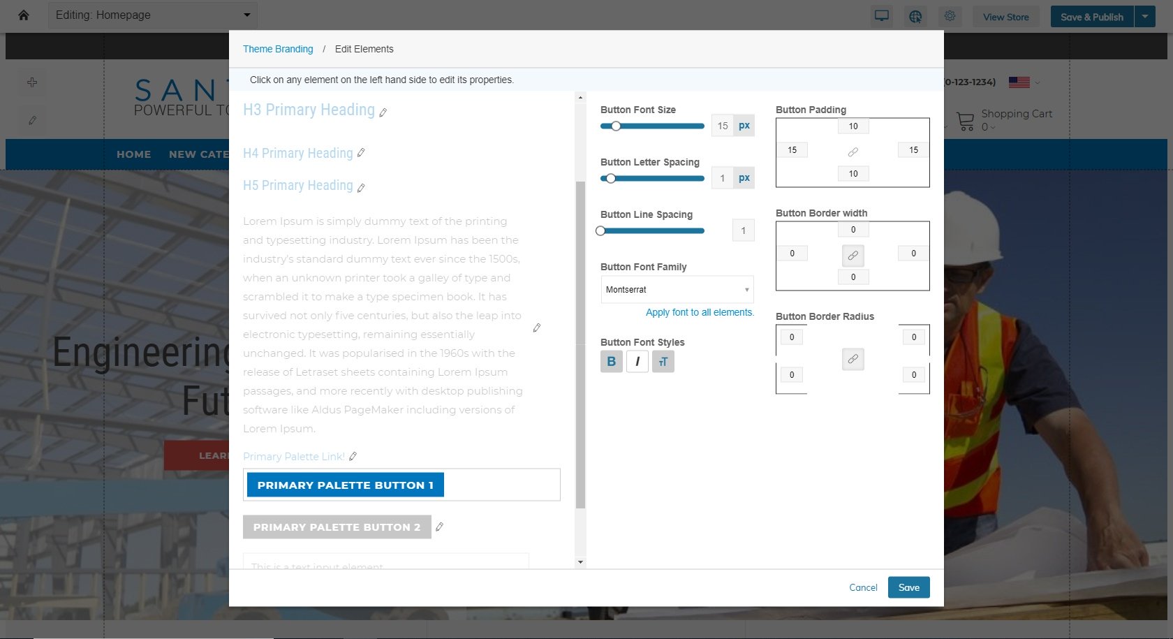
A new addition to the Visual Design Editor earlier this year was our Theme Fonts and Colors management tool. You can set fonts, font sizes, colors, spacing, and more for elements like buttons, headings and text used throughout your theme. The Theme Fonts and Colors section effectively lets you design a standard branding for your theme that all pages and blocks will default to. Individual blocks within your Visual Design Editor can be configured to use the default fonts and colors, select from “secondary” complementing theme colors, or customize with unique design settings.
Among the settings included for control at a global level are:
- Font, size and color and spacing for each of your heading levels (1-5)
- Font, size and color and spacing for paragraph/body copy
- Button font, size, color, padding, spacing and more
- The ability to set multiple color palettes including a primary and secondary palette for use across the site for brand consistency
- The ability to apply custom fonts uploaded for use on the site
More information about how to configure these settings can be found in Zoey’s support documentation.
That last item may have you asking: I can apply custom fonts? Zoey’s default setting lets you leverage hundreds of font choices through the free Google Fonts service, but you may have a specific brand font you wish to implement. That leads us to another new addition:
Asset Manager
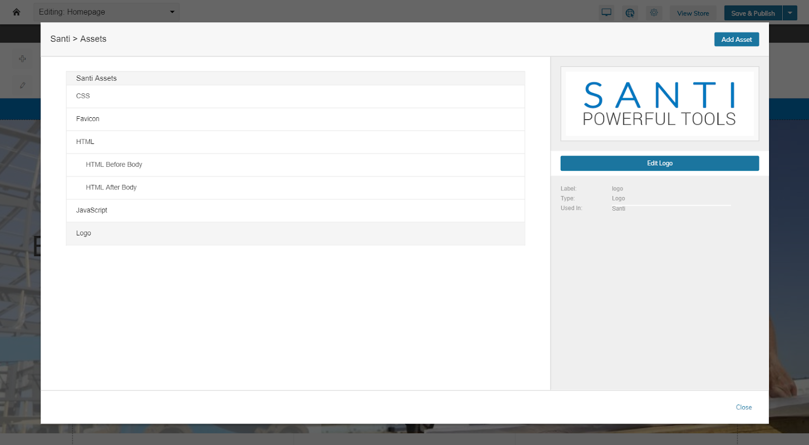
The asset manager lets you manage a number of different types of assets that allow for personalization of your Zoey store to make it your own:
- Logos, favicons for browser bars and other static imagery
- Custom web fonts for use on your page
- Javascript and HTML code snippets, either globally or on certain pages, for things like marketing or analytics
- CSS code, also globally or locally, for power users and developers who wish to use code to adjust elements that the Visual Design Editor may have limited ability to adjust
With the rollout earlier this year of the upgraded Visual Design Editor, the asset manager offers more distinct controls than our earlier version, along with access to areas that had previously been unavailable. So if you haven’t visited the editor in awhile, it may be worth a fresh look! And if you’re unsure how to get started, read more in the Zoey support docs.
Tablet and Mobile View Enhancements
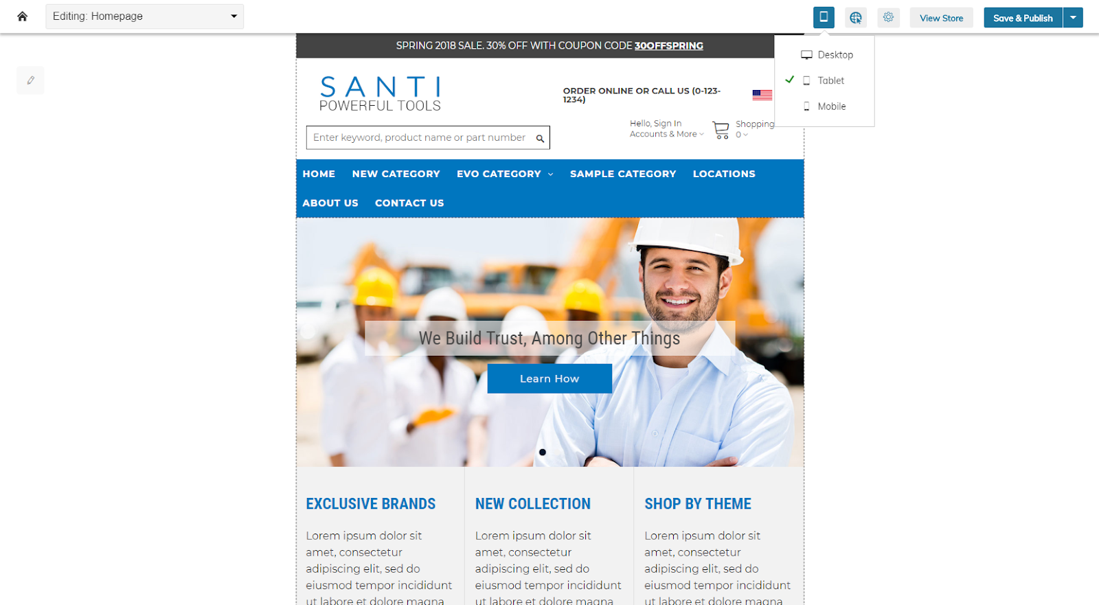
Another area that received significant upgrades in the latest update is the ability to manage tablet and mobile views of your store. Many of our new blocks are designed to offer good results in all browsers, but sometimes you want to make changes based on your customers or your design preferences.
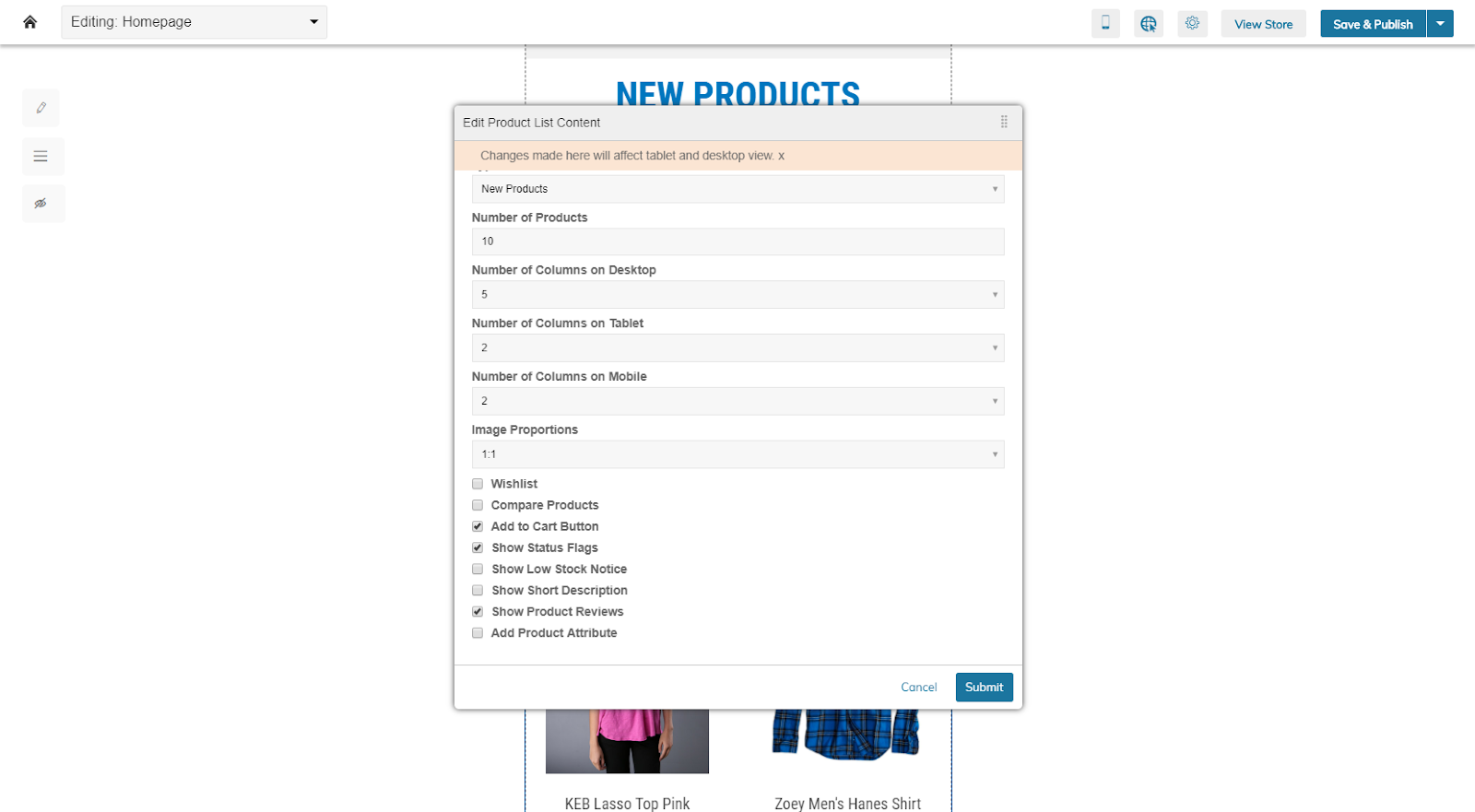
New settings let you decide how many columns appear on tablet and mobile for product listings, for instance. You can set your mobile design to Autostack using a new menu on the left side of the VDE called mobile design. You can also choose to hide blocks that are of less value, or create clutter, on your mobile site. These and other mobile and tablet specific settings can be reviewed in our support section article about the new features.
CMS Button for Editing All Content
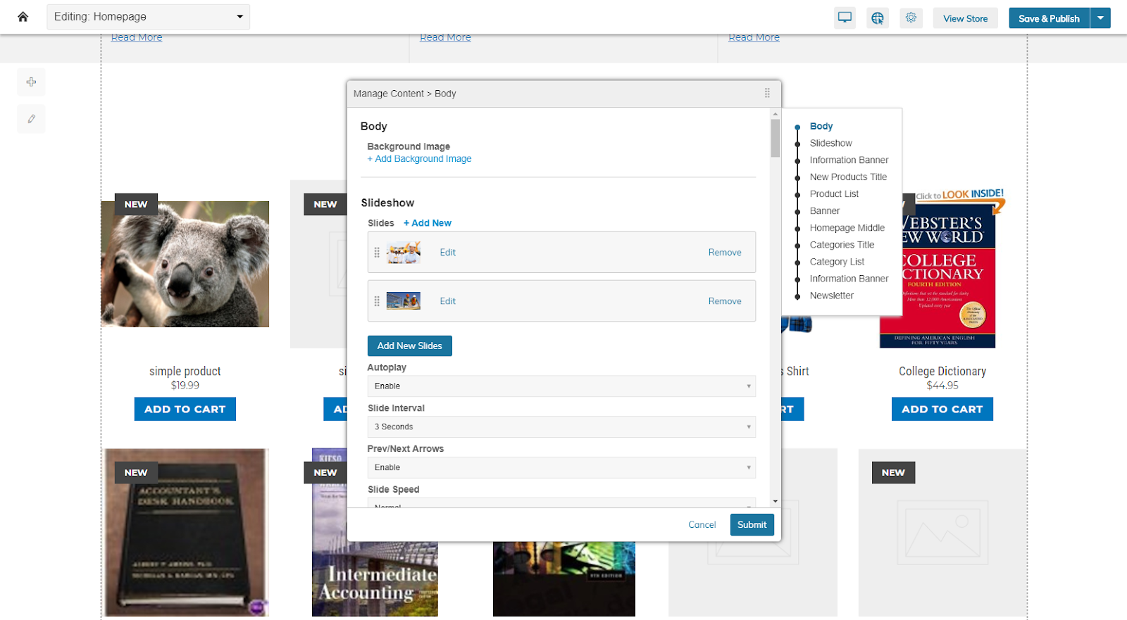
Our content management tools were greatly enhanced in the latest version of the Visual Design Editor, separating content from design for the first time. This lets copy and image updates take place easily without impacting the core design decisions.
But editing each piece can be a slow process, and sometimes you want access to all the content at one time. We’ve made that easy with the CMS button.
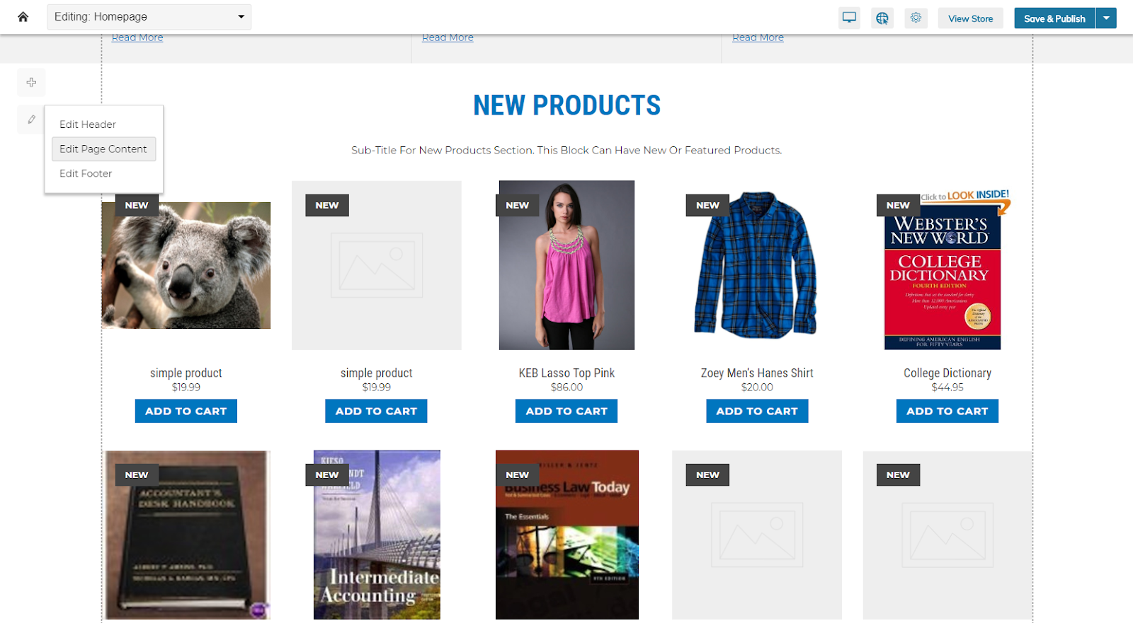
The pencil icon, which floats to the left under the + icon for new blocks, gives you access to edit your page header or footer, as well as your page content. Clicking one of those options loads up all of the editable components in that area, sequenced in the order they are on the page.
A navigation map on the right shows you what elements are available to edit. This effectively rolls up all the editable sections of the page into one location, simplifying updating a page by making everything available at once.
If you prefer to edit just one area, or focus in on a section of your page, you can access edit capabilities on a given block or region, so the choice is effectively yours.
Set Sizing and Lock Dimensions
There are times where objects resizing for tablet and mobile reach a size of unusuable proportions. This is most often the case with buttons, where you need to maintain a size that allows for fingers to touch them on a mobile screen, as well as smaller elements like a shopping cart icon or perhaps your site’s logo. In other cases, when using larger blocks, you need them to take a certain area on your page to ensure the page looks good and the content is accessible.
With the design editor upgrade we’ve added a couple of new size-related tools to ensure design quality at all screen resolutions.
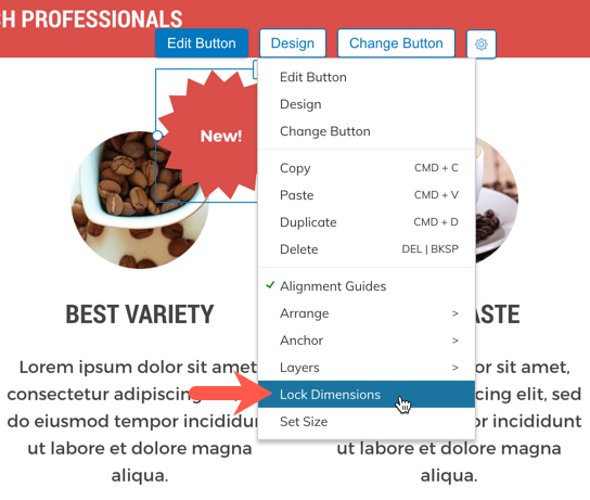
The Lock Dimensions feature lets you confirm that this is the size you wish to maintain regardless of the resizing being done to fit a given screen. This helps ensure that buttons are clickable or touchable, elements on small screens can be identified as easily as on large screens, and that when items shouldn’t resize for mobile, they’re kept in the same dimensions.
For blocks, you also have the ability to define, either in a pixel or percentage measurement, sizing, which can be set for desktop, tablet and mobile, to also ensure the block elements size properly for each view. This too helps retain the faithfulness of the elements on all screens.
This is Just a Taste
Zoey’s Visual Design Editor has hundreds of capabilities to make managing a site easy, and it is one of many tools developed by us to make managing a B2B or wholesale Ecommerce store simple. Contact us to learn more about Zoey and get a demonstration of what Zoey has to offer:

